← Selected work
03 / CAFE RIEDER
A café look, still taking shape.
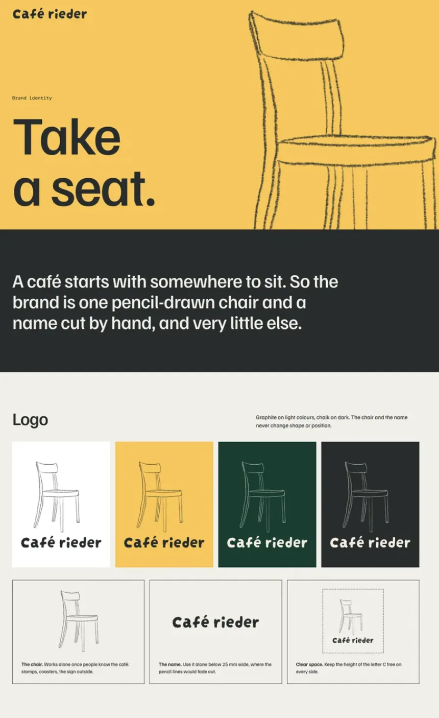
Cafe Rieder is a café and shop, and the home of Rieder’s Whisky-Truffes. We are exploring how it could look: one pencil-drawn chair, a name cut by hand and a few warm colours.
Work in progress
We are exploring the visual identity, creative direction and digital look and feel.
Nothing here is final yet. The logo and identity are still in development, and the website shown below is one possible direction, not a launched redesign.
Selected Work 03 · Cafe Rieder · the filmMade to watch without sound
Visual identity01
One chair, one name.
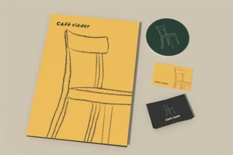
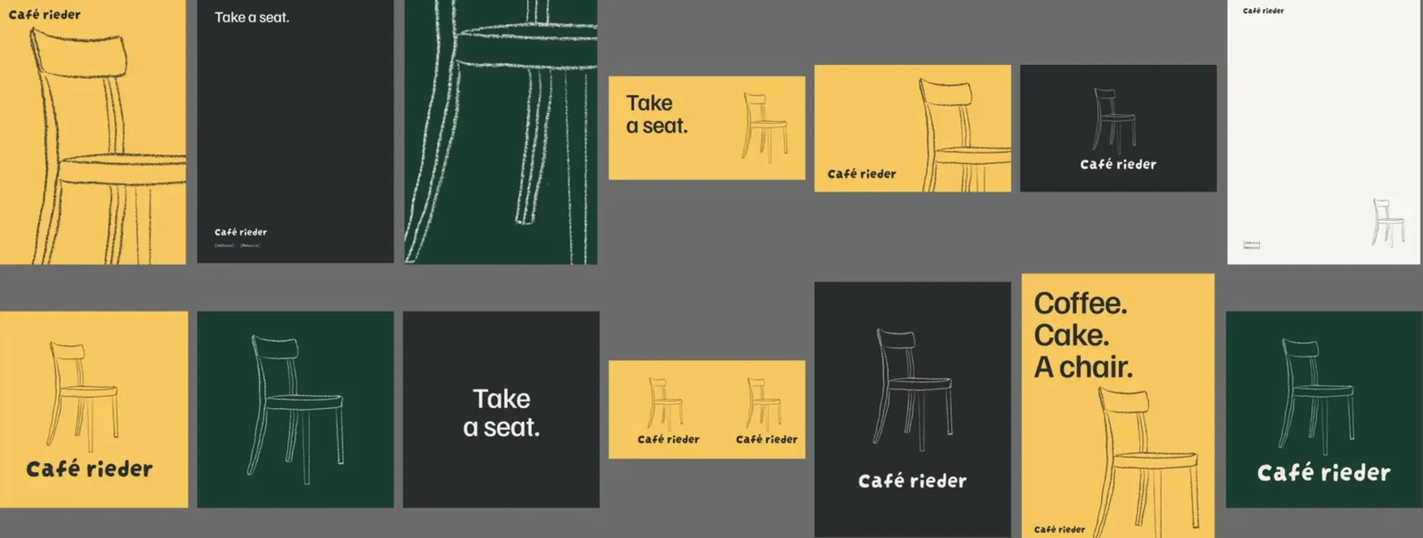
A café starts with somewhere to sit. So the identity is one pencil-drawn chair and a name cut by hand, and very little else.
Colour02
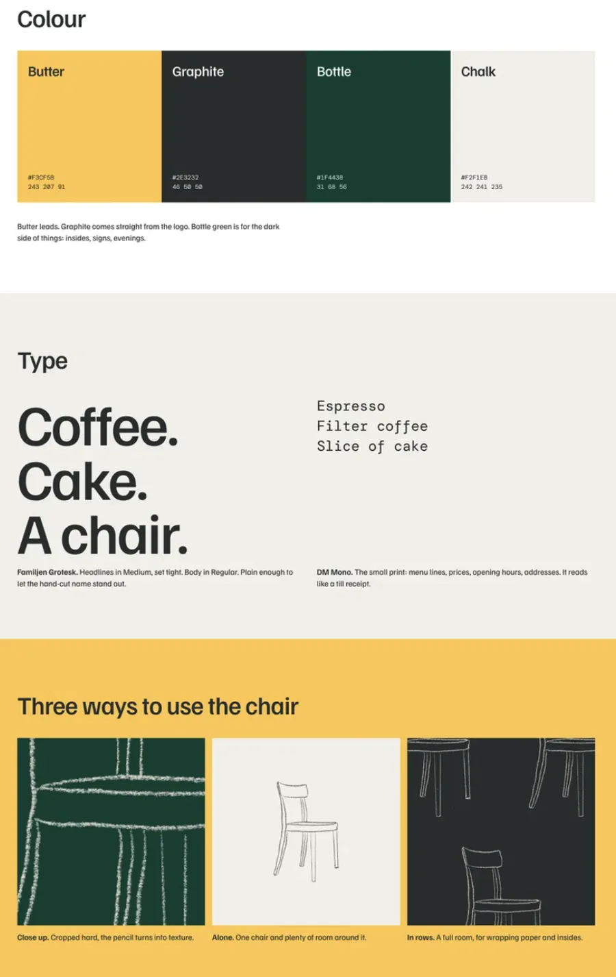
Butter leads.
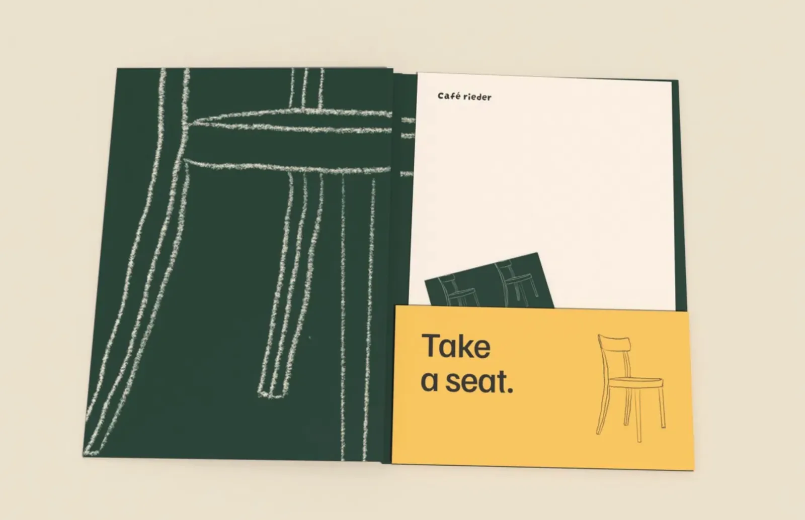
Graphite comes straight from the logo. Bottle green is for the dark side of things: insides, signs, evenings.
Type: Familjen Grotesk for headlines, DM Mono for the small print.
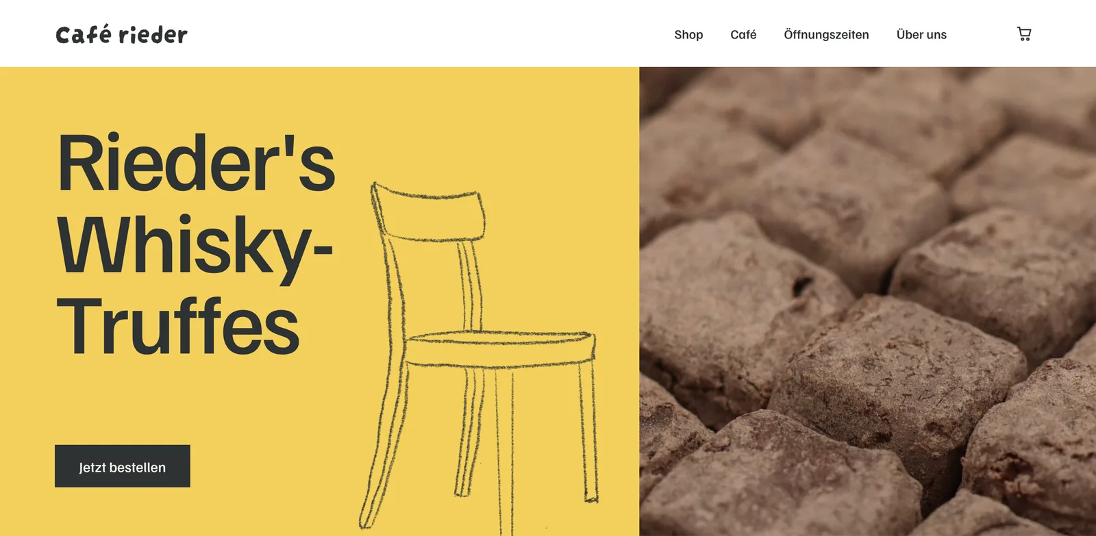
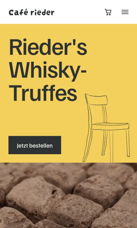
Website exploration03
Where it is now, and where it could go.
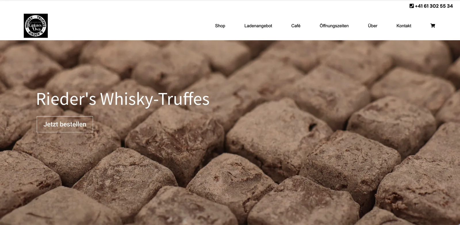
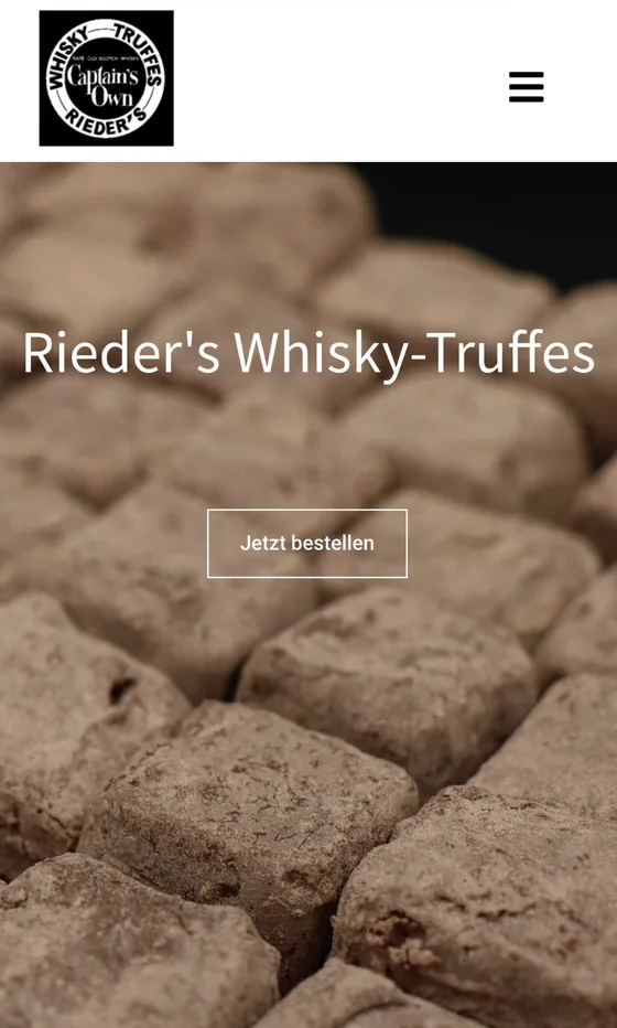
The current website next to one possible direction. The exploration is a design study, not a launched redesign.
Print04
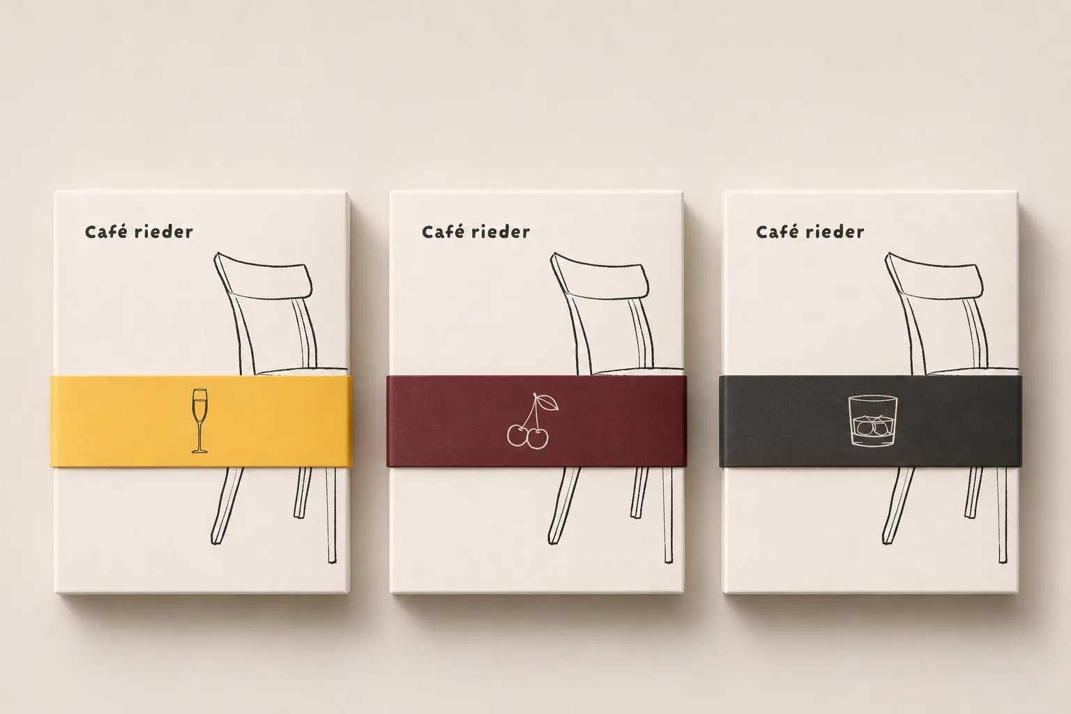
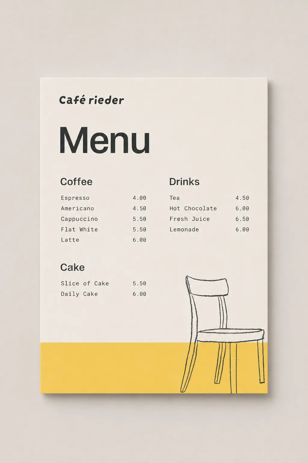
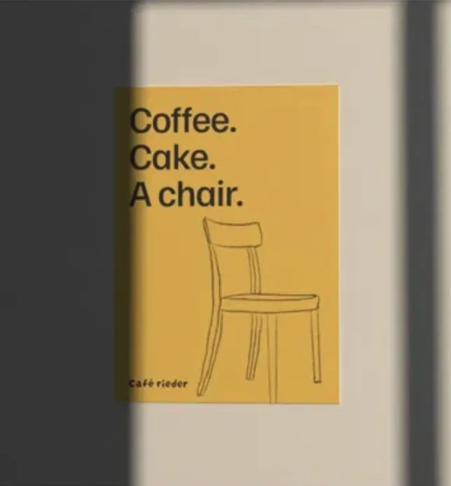
Coffee. Cake. A chair.
Packaging, a menu, a poster and stationery, all from the same chair. Shown as mockups while the identity develops.
Your turn
Your place could be next.
A hotel, a café, a bar, a shop or a venue. Tell us about it, and we’ll tell you where we’d start.