← Selected work

03 / CAFE RIEDER

A café look, still taking shape.

Visual Identity · Creative Direction · Website Exploration · Print

Cafe Rieder is a café and shop, and the home of Rieder’s Whisky-Truffes. We are exploring how it could look: one pencil-drawn chair, a name cut by hand and a few warm colours.

Work in progress

We are exploring the visual identity, creative direction and digital look and feel.

Nothing here is final yet. The logo and identity are still in development, and the website shown below is one possible direction, not a launched redesign.

Selected Work 03 · Cafe Rieder · the filmMade to watch without sound

Visual identity01

One chair, one name.

A café starts with somewhere to sit. So the identity is one pencil-drawn chair and a name cut by hand, and very little else.
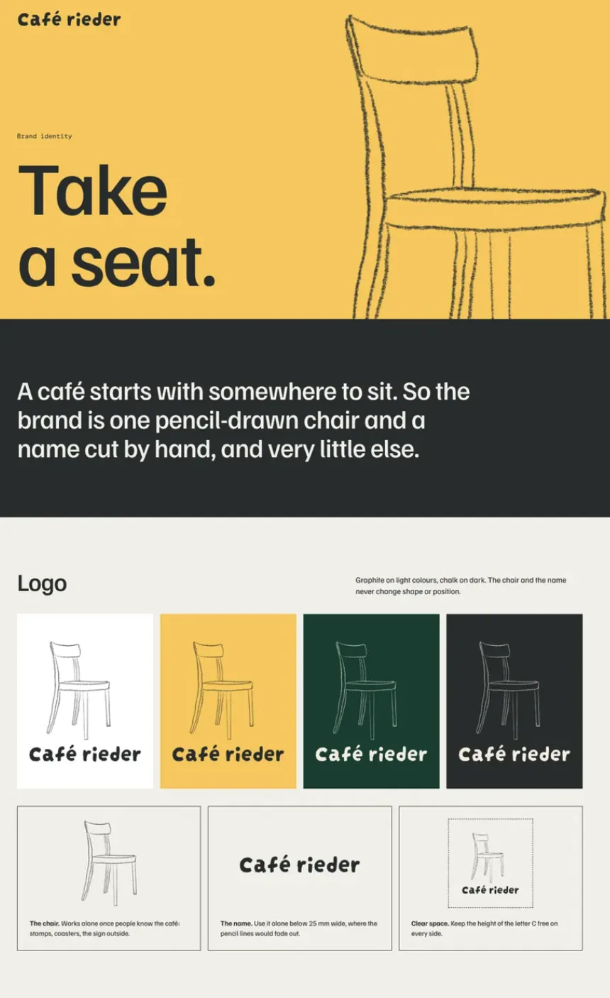
Brand guide page: Take a seat, with the pencil-drawn chair and the name Café rieder on white, butter, bottle green and graphite
The chair and the name, on the four colours. Exploration.
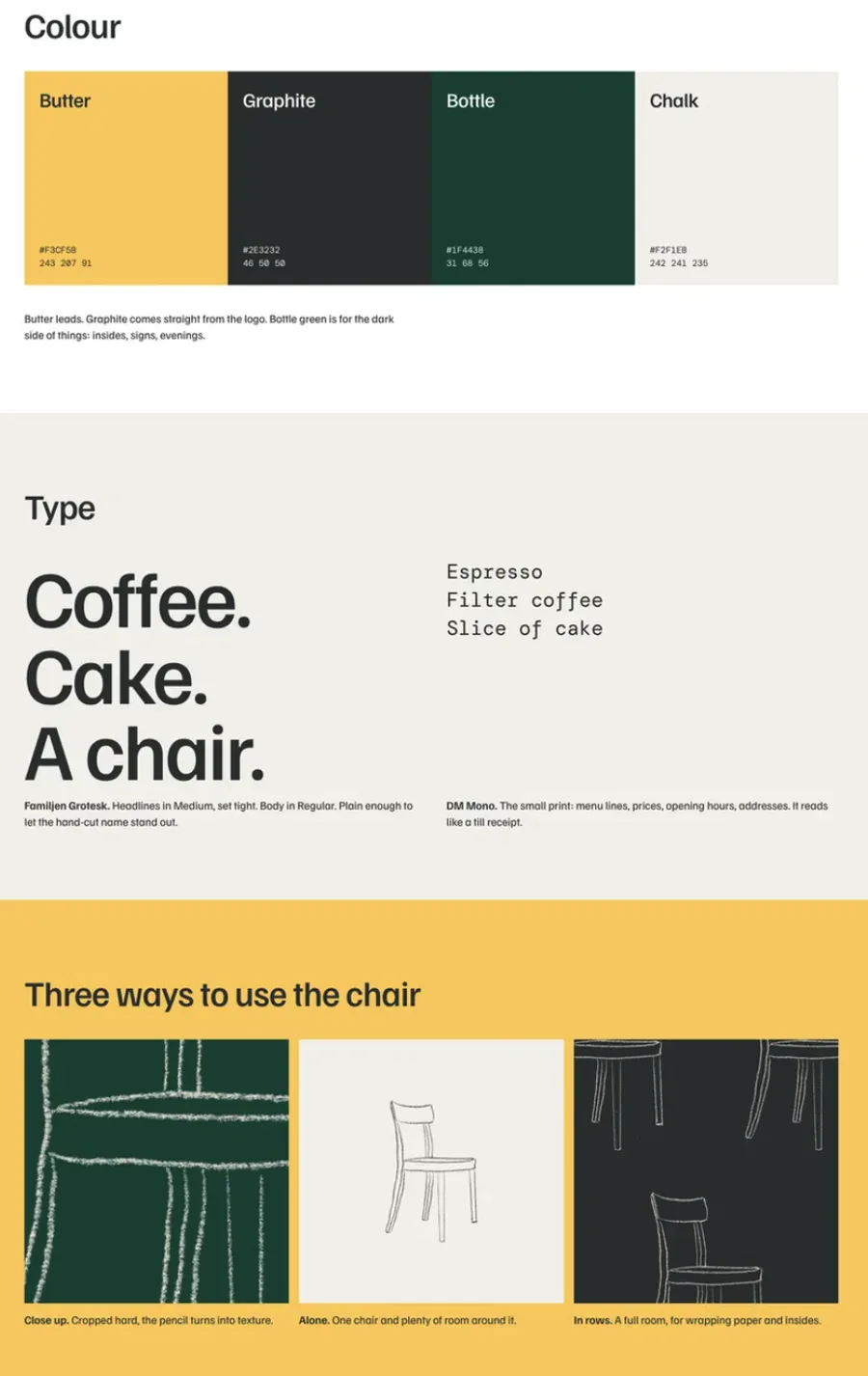
Brand guide page: the colours Butter, Graphite, Bottle and Chalk, the typefaces, and three ways to use the chair
Colour, type and three ways to use the chair: close up, alone and in rows.

Colour02

Butter leads.

Graphite comes straight from the logo. Bottle green is for the dark side of things: insides, signs, evenings.

Butter#F3CF5B
Graphite#2E3232
Bottle#1F4438
Chalk#F2F1EB

Type: Familjen Grotesk for headlines, DM Mono for the small print.

Website exploration03

Where it is now, and where it could go.

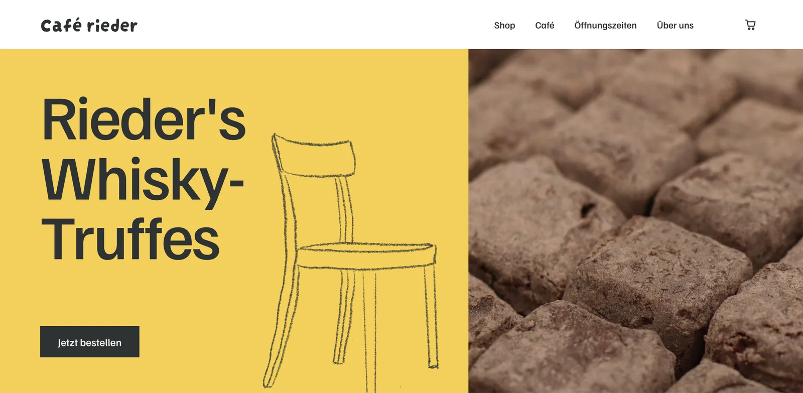
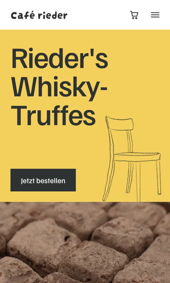
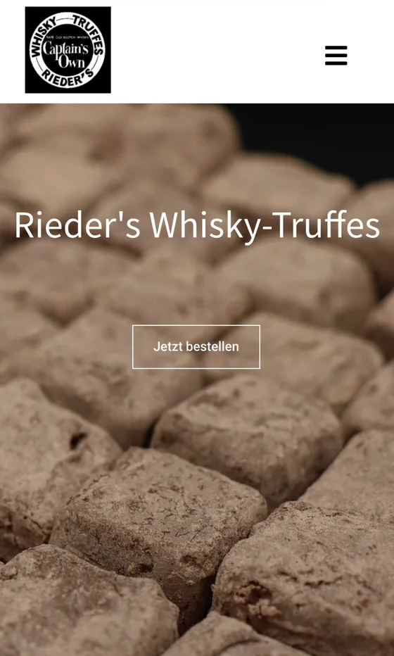
The current website next to one possible direction. The exploration is a design study, not a launched redesign.
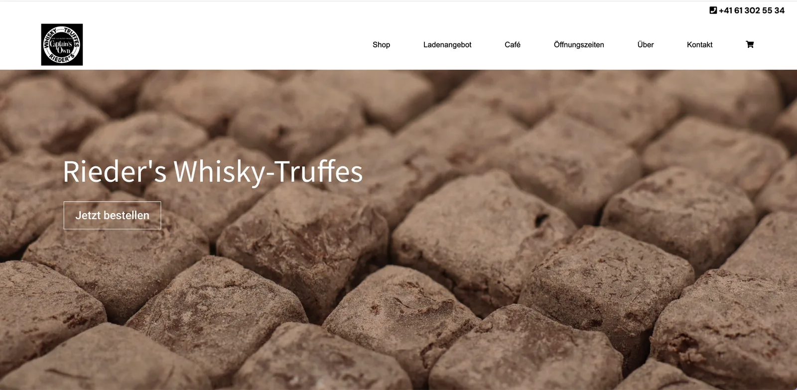
The current Cafe Rieder website on a laptop: a photograph of whisky truffles, Rieder’s Whisky-Truffes and a button, Jetzt bestellen
Desktop
The current Cafe Rieder website on a phone
Phone
The proposed exploration on a laptop: Rieder’s Whisky-Truffes set large on butter yellow, with the pencil-drawn chair next to the truffle photograph
Desktop
The proposed exploration on a phone
Phone

Print04

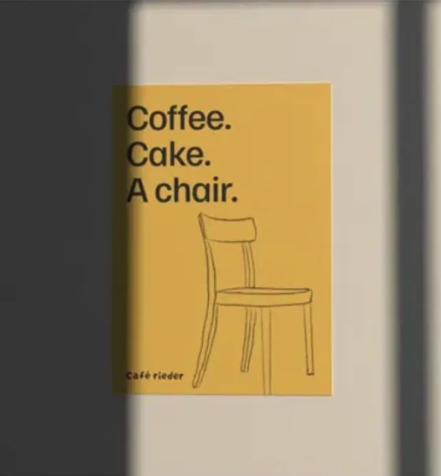
Coffee. Cake. A chair.

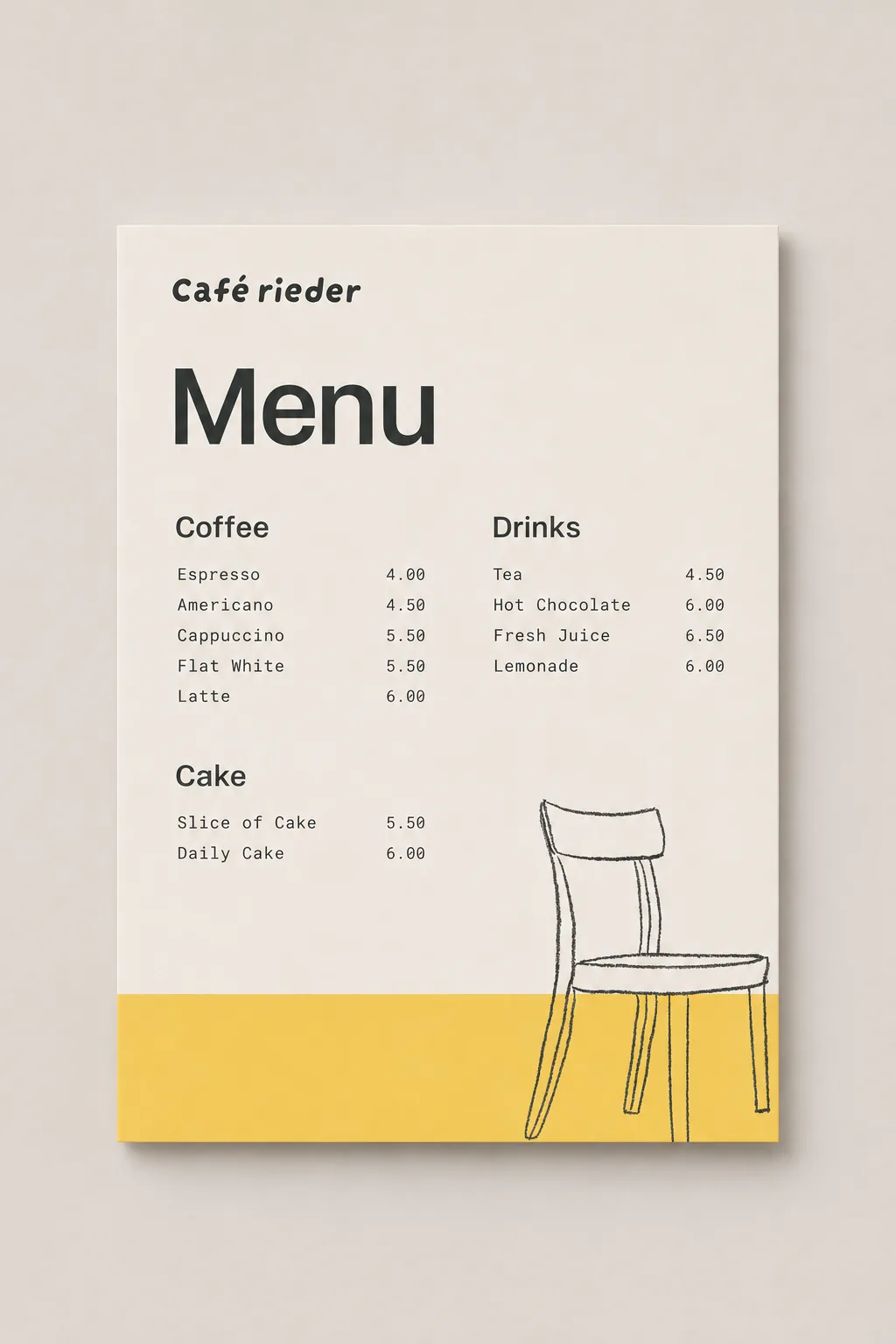
Packaging, a menu, a poster and stationery, all from the same chair. Shown as mockups while the identity develops.
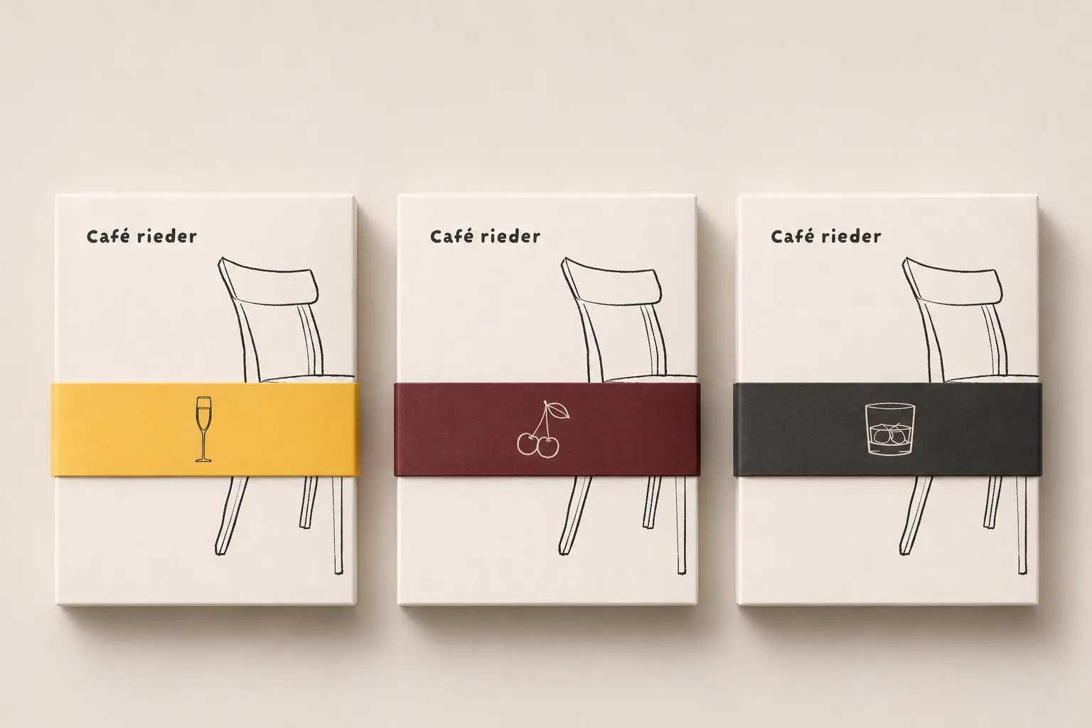
Three boxes with the chair and the name, each with a band in butter, wine red or graphite
Packaging
A menu card: coffee, drinks and cake, with the chair on a butter band
Menu
A butter poster: Coffee. Cake. A chair.
Poster
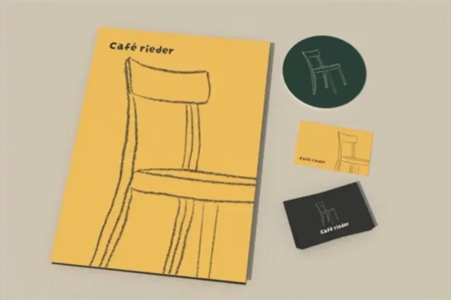
Stationery: a butter folder with a large chair, a coaster and business cards
Stationery
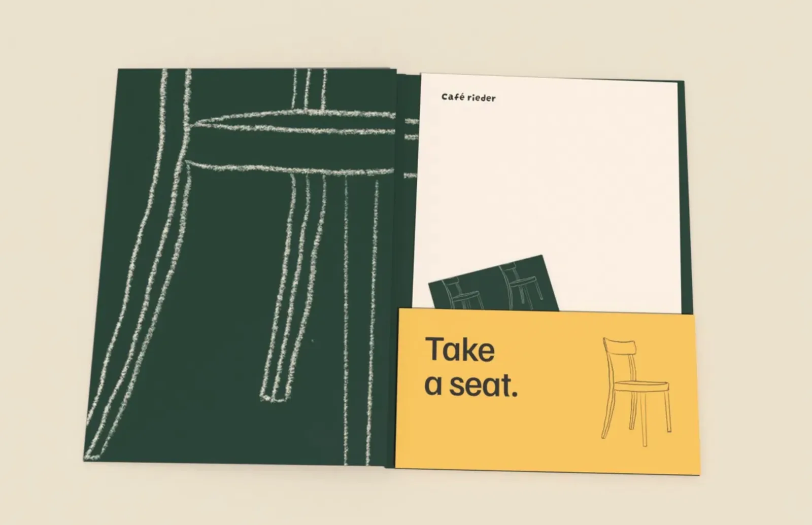
A bottle green folder with a chalk chair and a butter card: Take a seat.
Folder
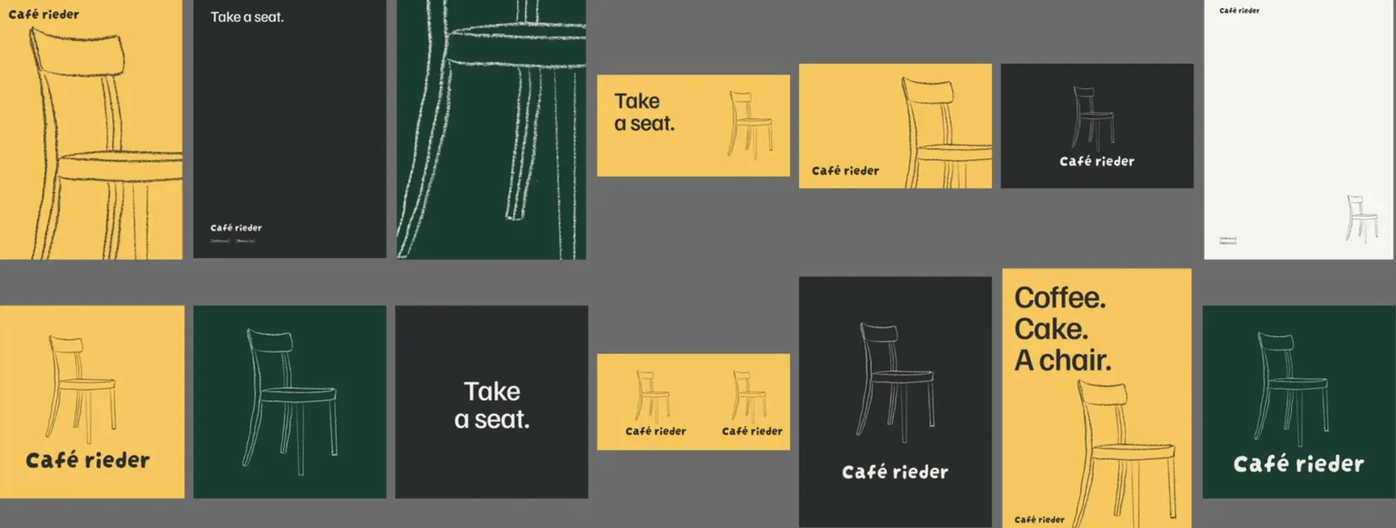
The identity across many formats: posters, cards and signs in butter, graphite and bottle green
The system at a glance.

Your turn

Your place could be next.

A hotel, a café, a bar, a shop or a venue. Tell us about it, and we’ll tell you where we’d start.