02 / HEYLOOK
A brand built around looking.
Our own identity: a wordmark, a small palette, one typeface and four graphic elements that all come back to one idea. Two eyes, looking.
Selected Work 02 · HEYLOOK · the filmMade to watch without sound
Wordmark01
Soft, joined-up, friendly.
A soft, joined-up wordmark that sounds like what it says. It works on one line, and stacked, where the o’s become eyes.
The horizontal wordmark, white on ink.
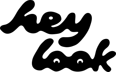
Stacked, looking.
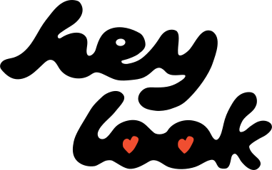
Stacked, in love.
Colour02
The core colours.
Ink for words, cobalt for action, soft pink for warmth, signal red for the moment someone looks.
Type03
One typeface, said plainly.
Manrope, from quiet to loud. Big words, short sentences.
Good things deserve to be seenManrope ExtraBold
Your place is great. Does the internet know?Manrope Medium
Graphic elements04
Everything comes in pairs.
Dots only ever come two by two, like eyes. Never one alone.
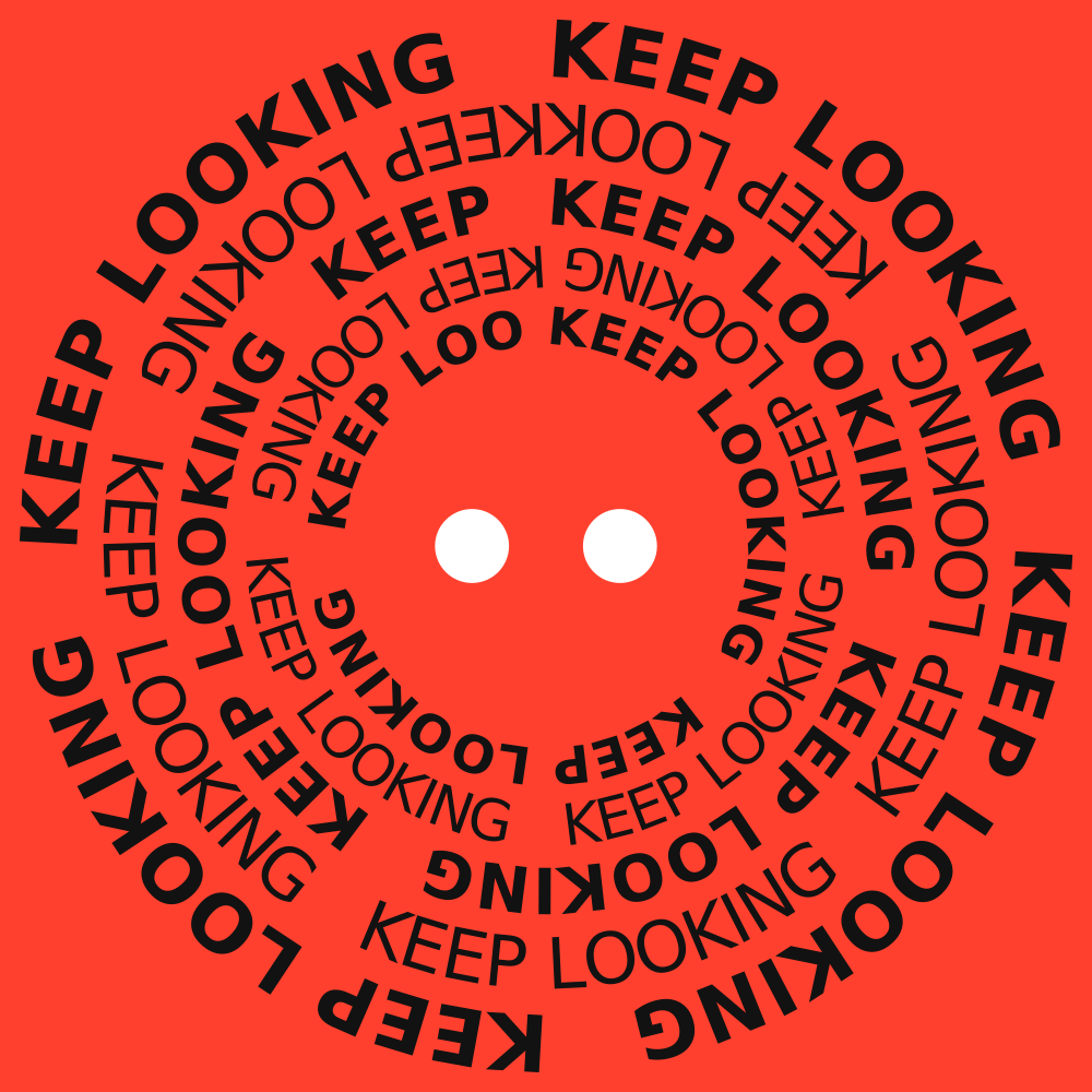
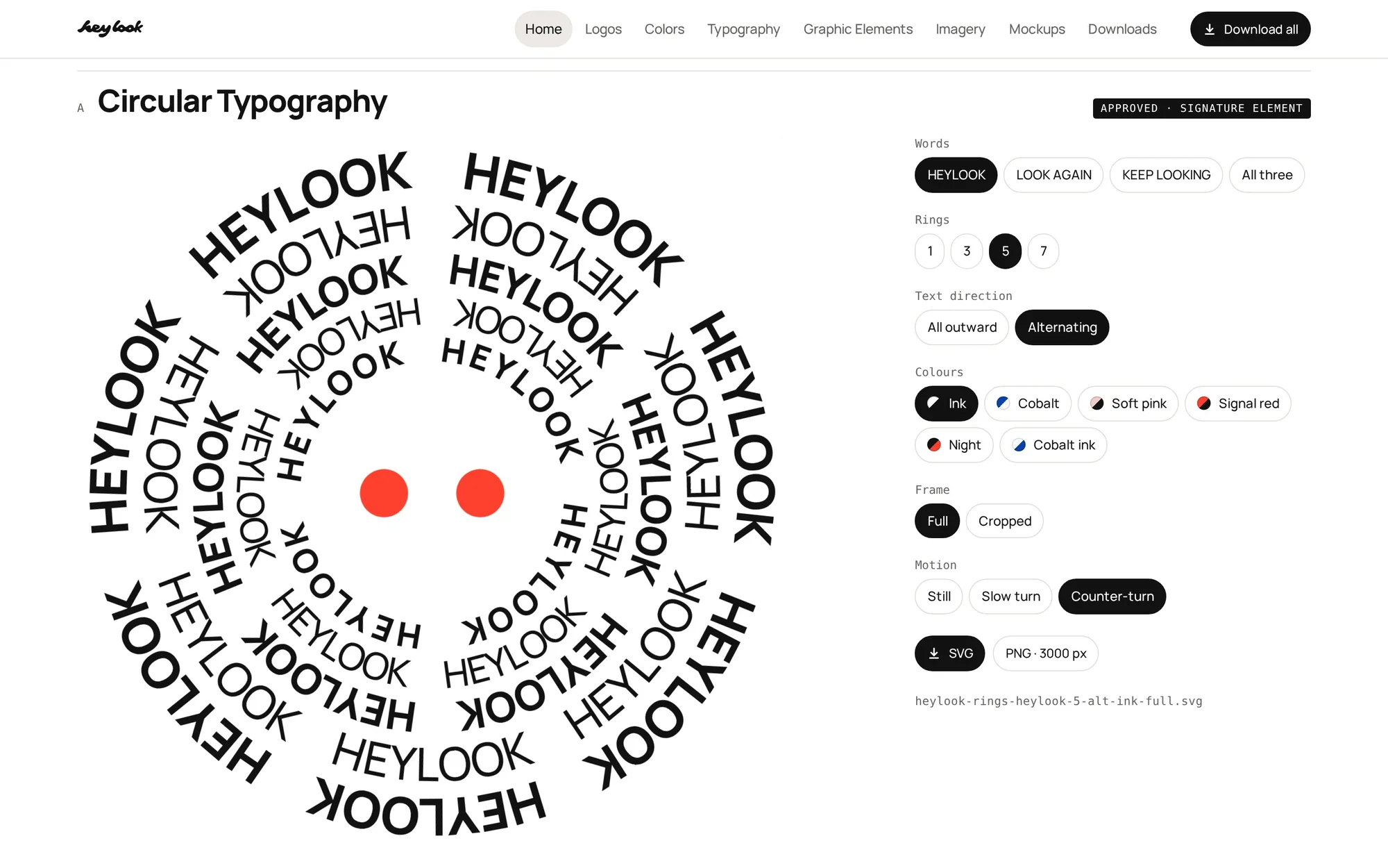
Circular typography
Words in rings around a pair of eyes. Cropped big, turning very slowly.
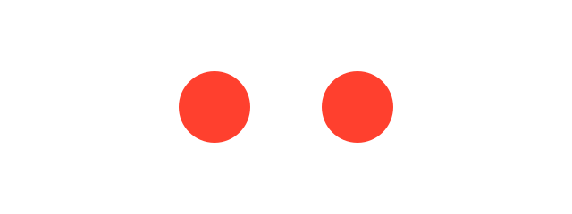
Double Dots
Two dots, the same size, one diameter apart. A sign-off, and the mark of whatever is being looked at.
The Blink
Two dots close to two short lines, then open. Used small and alone, for quiet endings.
look
closer
Out of focus
Real blur in the photograph, sharp type on top. Shown here with the one brand photo we have so far.
Digital brandbook05
All the rules, in one place.
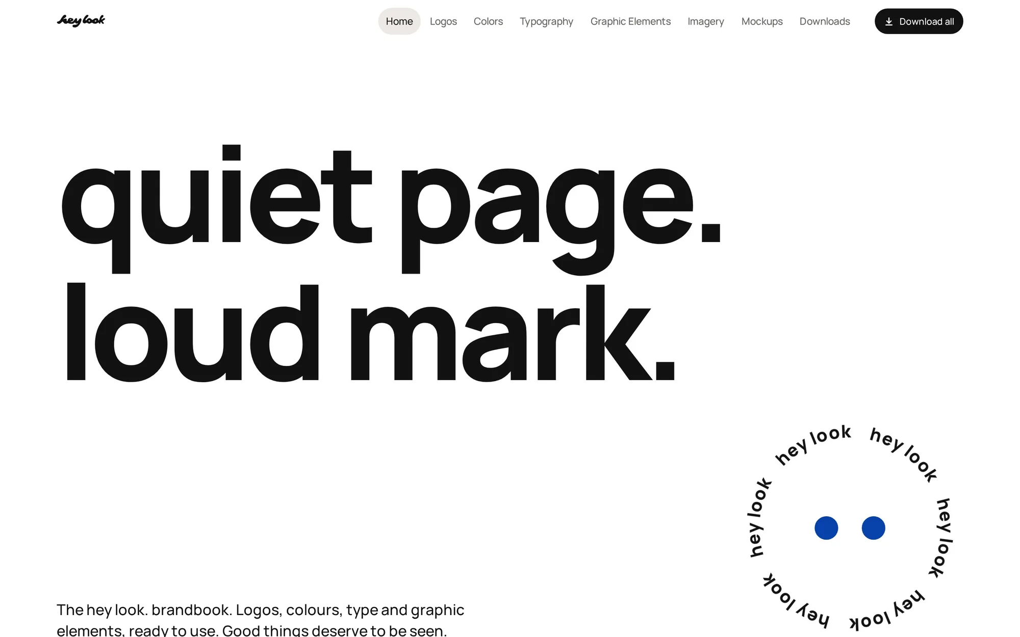
Everything above lives in an online brandbook, so the brand looks the same whoever uses it. It is private for now.
Website06
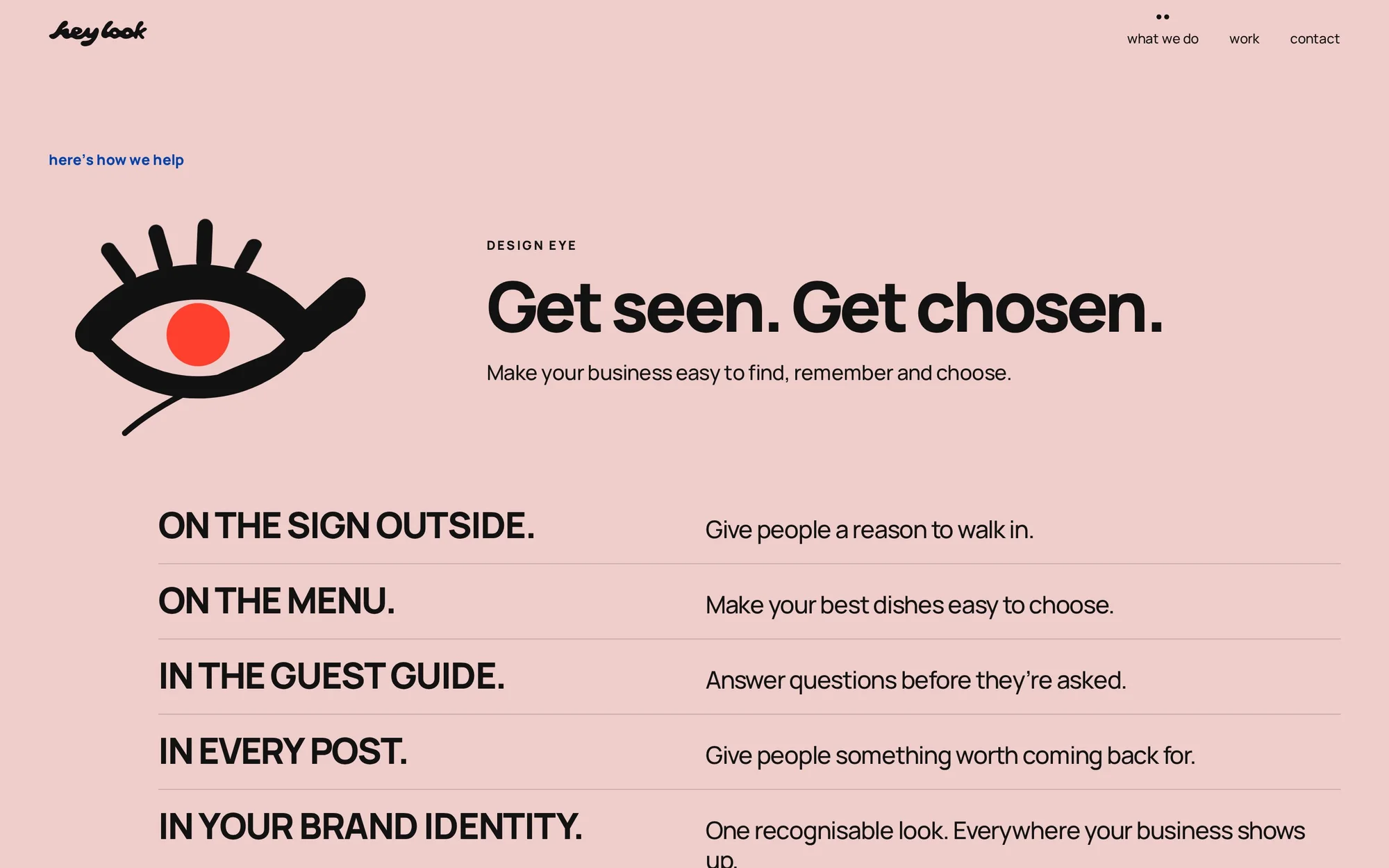
Our own site, on every screen.
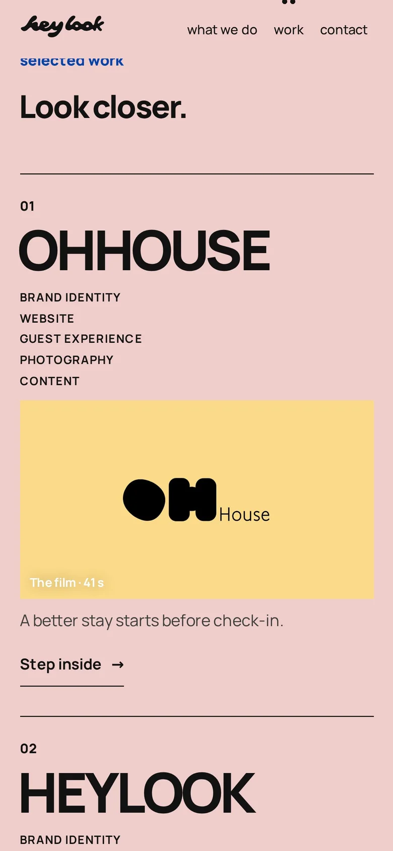
The site you’re on right now, designed and built by us. Same voice, same eyes, on a laptop and on a phone.
Your turn
Your place is great. Let’s show it.
A hotel, a café, a bar, a shop or a venue. Tell us about it, and we’ll tell you where we’d start.
Social media07
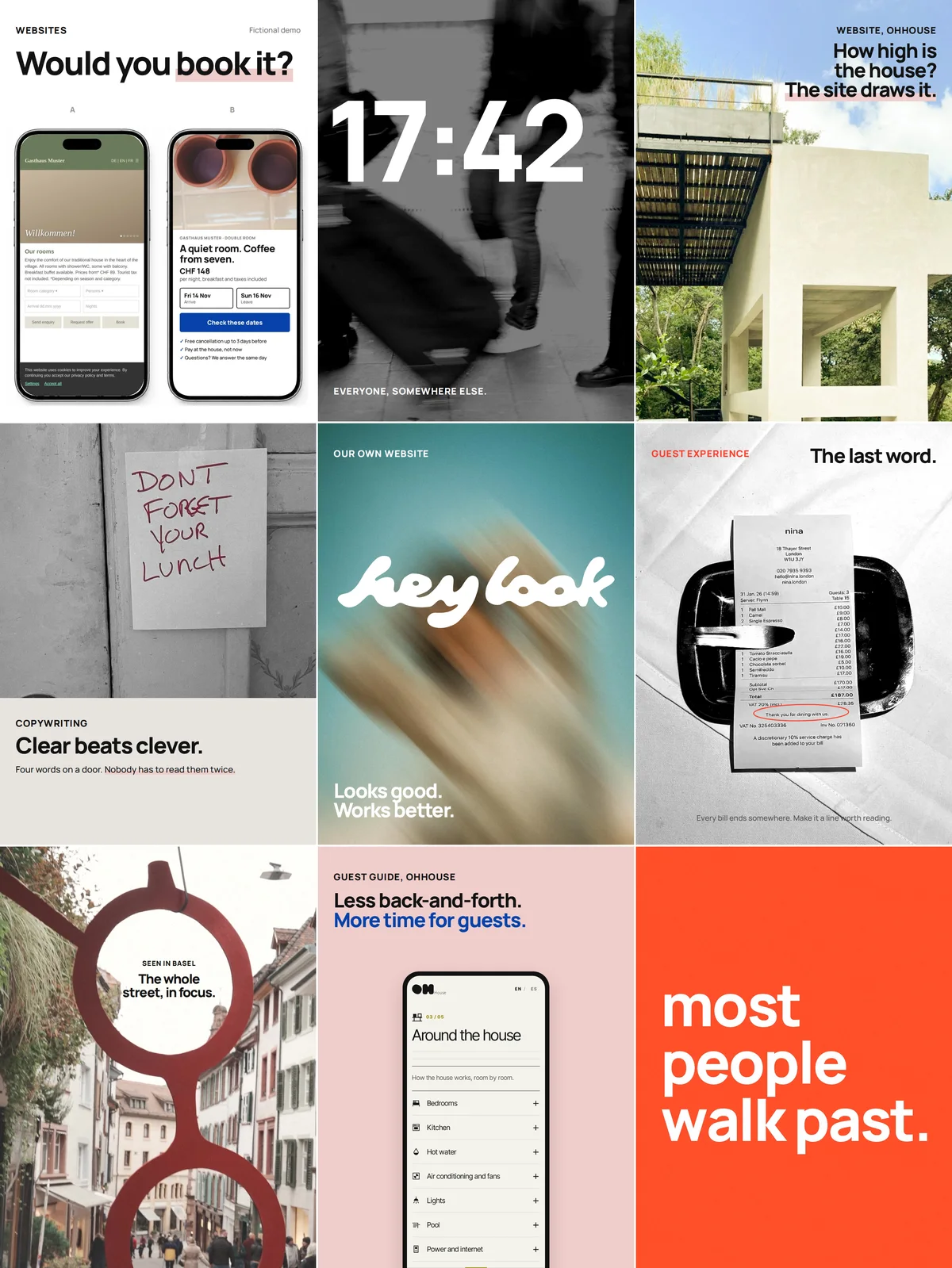
Nine posts, one way of looking.
A design direction for our Instagram: real places, real work, a few short words. Shown here as a concept, not as the live feed.